
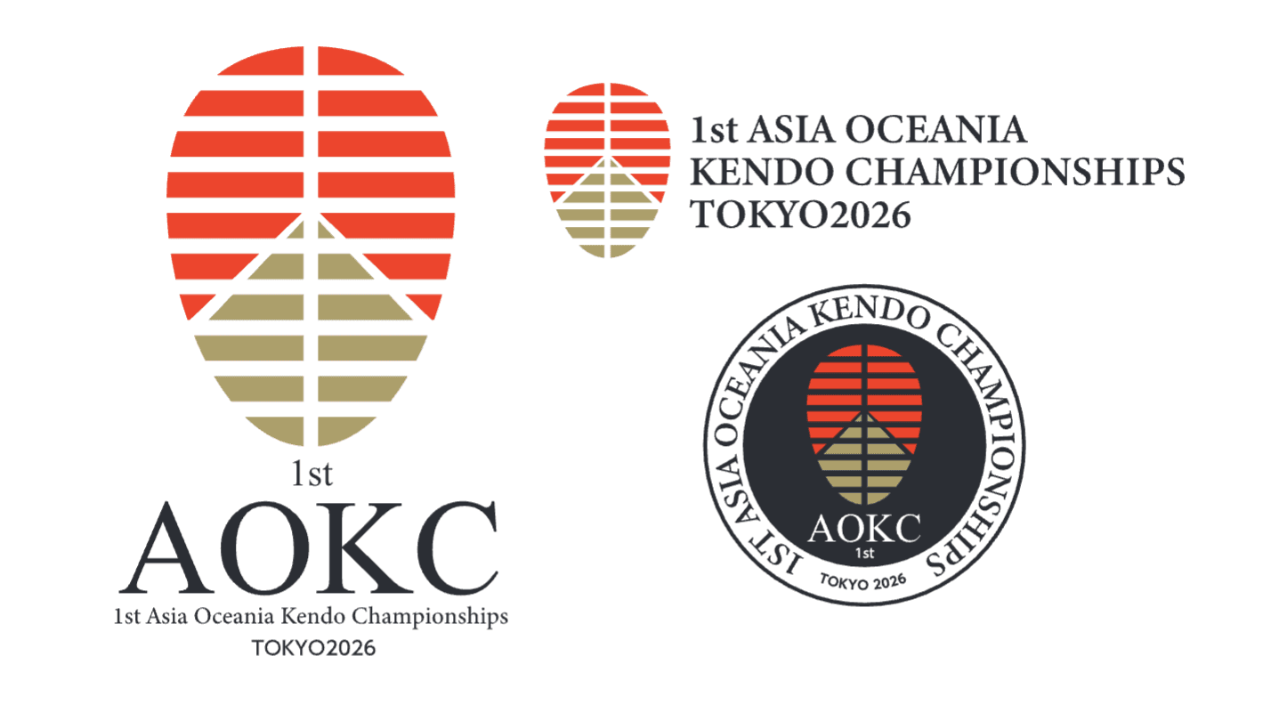
Designer's comments
Using the motif of “the landscape spreading out beyond athlete's men,” the design effectively utilizes the negative space around the symbol mark and the men-gane to create a design centered on the athletes. The athletes' field of vision is filled with a burning red sky and a golden road stretching out into the distance. The red sky symbolically represents
the quiet determination of athletes burning within their solitude, with a single path (the path of human development) extending straight ahead, representing kendo. In addition, the red color evokes the Japanese flag, and the gold color symbolizes glory and hope in traditional Japanese culture, vividly expressing the essence of Japan. The letters “AOKC” are written in a sharp font that evokes the sharpness and beauty of Japanese swords, adding strength and sophistication to the overall design.
Designer : Mr. Masanori NAITO
Return to list